I’m not a graphic designer.
I am an opinionated person, though.
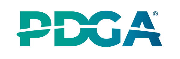
So when the PDGA announced its first logo overhaul in over 25 years, I wasted no time putting on my hot-take pants – they’re blue. I wasn’t the only one stepping into a pair, either. Regardless of channel, all over social media, you’d find some iteration of the following from disc golfers:
- Issue No. 1 – “It’s a bit dull.”
- Issue No. 2 – “It’s pretty boring.”
- Issue No. 3 – “It’s overly simple.”
- Issue No. 4 – “It’s got ‘aquarium’ written all over it.”
But you know what?
I like it.
People hate change. And wouldn’t you know it, whether warranted or not, many of those same people love to bash on the PDGA. Whatever your stance on the new design, though, in six months’ time, you’ll have grown accustomed to it: gear, graphics, feather banners, etc.
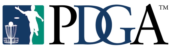
If all of this is news to you, since 1997, the PDGA has worked with some version of this:
As of two days back, changes were made …
Sink your teeth into it:
What I like most about the new logo is the modernity of it all – the old one’s dated. And yes, I get the tradition argument. It works for the Cleveland Browns and New York Yankees, right? But even without any detail, it’s obvious the “throwing man” (Mark Vasicek) is a product of the 90s.
Also, for as much as I think following the trail blazed by the PGA long ago is a smart move for the PDGA and DGPT, if ever there was a safe place to diverge a bit, it’d be the logo. If you don’t follow professional golf, click here to see the PGA’s design – simply too much coat-tailing.
Furthermore, I dig the aqua color scheme – I’m glad it made the cut. It looks good, which is logic enough to keep it. But part of the reasoning behind the PDGA’s logo redesign was to bring about a more worldwide feel with its visual branding. Green for land, and blue for water: It’s a globe.

And lastly, the silhouette of that disc is a pop-top Star Destroyer …
Don’t tell me otherwise.
Listen, a logo’s a logo’s a logo …
Let’s not make more out of this than four letters: P-D-G-A
If you’re a member of the PDGA, lose your mother-freaking mind over other stuff: Ratings, divisions and mandatory rules that are near impossible to understand – take your pick.
But this?
Let the boys play with their crayons.
Have anything to add? Take to Twitter to let us know – we’ll actually (for real) get back to you.
Editor’s Suggestions:
- Gannon Buhr literally invented a new way to putt
- The Innova Destroyer: Disc golf’s original ‘dual-threat’ disc
- Gripe No. 20: The guy who cuts down ‘difficult’ trees on a course
Real quick, if you happen to buy something through a link in this article, there’s a chance we’ll get a small share of the sale. It’s how we keep the lights on. To learn more, click here.